The tibble package within the the tidyverse provides ‘a modern take on data frames.’ It’s loaded with nice features, one of which is the ability to store list-columns. List-columns provide a concise way to store lists within a row of a data frame. In particular, this is useful for storing functional data because a common feature in such data is that each function is not collected at the same number of points. As an example, let’s simulate some sinusoids:
library(tidyverse)
## Loading tidyverse: ggplot2
## Loading tidyverse: tibble
## Loading tidyverse: tidyr
## Loading tidyverse: readr
## Loading tidyverse: purrr
## Loading tidyverse: dplyr
## Conflicts with tidy packages ----------------------------------------------
## filter(): dplyr, stats
## lag():    dplyr, stats
set.seed(123)
n <- 5
factor_1 <- c(rep('A', n), rep('B', n))

response <- function(x,mu, A, B, C){
  mu + A*sin(x*B + C)
}

out <- sapply(factor_1, function(y){
n_pts <- floor(rnorm(1, 100, 10))
x <- seq(-pi/2, pi/2, length.out = n_pts)
mu <- ifelse(y == 'A',2,1)
mu <- rnorm(1, mu, .1)
A <- rnorm(1, 2, sd = .3)
B <- rnorm(1, 3, sd = .3)
C <- rnorm(1, pi/8, sd = .1)
list(x = x, output = response(x,mu,A,B,C))
})
There are 5 curves in each level of the factor factor_1 (A or B). The average difference in the two levels is a vertical mean shift and each function has some amplitude and horizontal variation. Each function has around 100 points but this varies. Tibble’s framework allows us to store this type of data concisely using list-columns:
tbl <- tibble(test = 1:length(factor_1),factor_1 = factor_1, x =  out[1,], y = out[2,])
tbl
## # A tibble: 10 x 4
## test factor_1 x y
## <int> <chr> <list> <list>
## 1 1 A <dbl [94]> <dbl [94]>
## 2 2 A <dbl [117]> <dbl [117]>
## 3 3 A <dbl [112]> <dbl [112]>
## 4 4 A <dbl [117]> <dbl [117]>
## 5 5 A <dbl [89]> <dbl [89]>
## 6 6 B <dbl [83]> <dbl [83]>
## 7 7 B <dbl [104]> <dbl [104]>
## 8 8 B <dbl [106]> <dbl [106]>
## 9 9 B <dbl [93]> <dbl [93]>
## 10 10 B <dbl [88]> <dbl [88]>Plotting the data with base R can be done easily enough:
yrange <- range(sapply(tbl$y, function(y) range(y)))
plot(NULL, type = 'l', col = 1, ylim = yrange, xlim = c(-pi/2,pi/2), ylab = 'y', xlab = 'x')
for(i in 1:nrow(tbl)){
  matplot(tbl$x[[i]], tbl$y[[i]], type = 'l', col = ifelse(tbl$factor_1[i] == 'A',1,2), add = TRUE)
}
grid()
legend('topright', col = c(1,2), lty = 1, legend = c('A','B'), title = 'factor_1')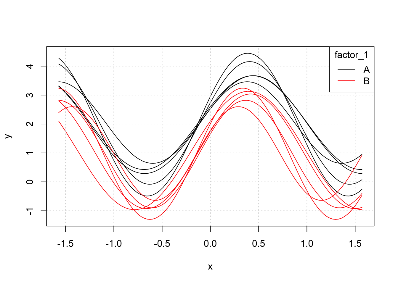
While this is satisfactory, users of ggplot2 understand some of its advantages over base graphics. When first thinking about plotting with ggplot2, I was hoping this would work:
gplot <- ggplot(tbl, aes(x = x,y = y, group = test, colour = factor_1)) +
  geom_line()
Unfortunately, this throws an error since the functions have different lengths. A work-around is to expand the tibble to fit the so-called tidy format with each observation on each function corresponding to a single row. Originally I was using do.call() to do this. Then I happily discovered tidyr::unnest (and its inverse tidyr::nest):
# tbl2 <- do.call(rbind,apply(tbl,1, function(r) tibble(test = r$test, factor_1 = r$factor_1, x = r$x, y = r$y)))
# tbl2

(tbl2 <- unnest(tbl))
## # A tibble: 1,003 x 4
## test factor_1 x y
## <int> <chr> <dbl> <dbl>
## 1 1 A -1.570796 4.275455
## 2 1 A -1.537016 4.172024
## 3 1 A -1.503235 4.045749
## 4 1 A -1.469455 3.897947
## 5 1 A -1.435674 3.730154
## 6 1 A -1.401893 3.544116
## 7 1 A -1.368113 3.341771
## 8 1 A -1.334332 3.125223
## 9 1 A -1.300552 2.896725
## 10 1 A -1.266771 2.658657
## # ... with 993 more rows# Note: tbl2 %>% group_by(test, factor_1) %>% nest() or simply nest(tbl2, x,y) gets you back to tbl (almost...do you see what's different?)
(gplot <- ggplot(tbl2, aes(x = x,y = y, group = test, colour = factor_1)) +
geom_line())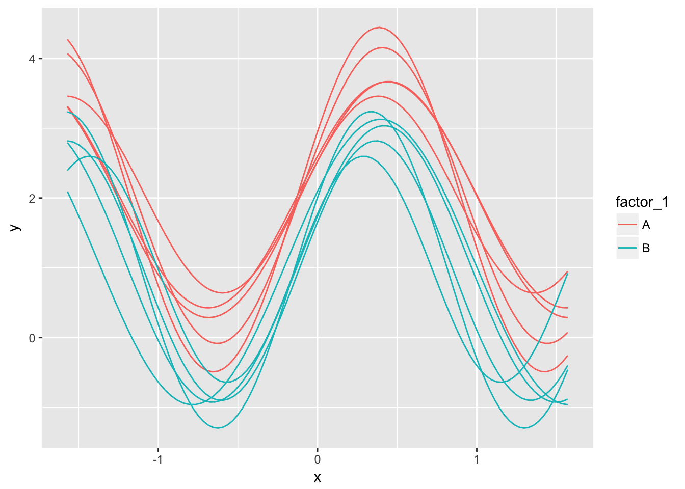
This works well. One departing thought – In many cases functional data is collected at ~1e6 or more points and expanding the table as above could easily result in tens of millions of rows - with a bunch of redundant information in the first two columns ‘test’ and ‘factor_1.’ My guess is this really isn’t that big of an issue…but if you think it is, please let me know.